This year's Creative Circus will be held on Thursday, August 23rd. This year, as tradition has had it, there are four categories, a talent show, culinary cook-off, art show, and side show acts. Each year the agency also has a Poster Design contest that is open for all employees to participate in. This contest is usually pretty open to what ever you want to create. I always enjoy participating in this kind of stuff, especially if I have the time to do so.
In 2004, I decided to give this Poster Design contest a try and came up with the idea below. I was trying to do an illustration that had the same kind of perception like the skits that happened on the television show "Three's Company".

(click on image to enlarge)
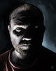
Unfortunately, this one didn't go over too well with our HR department and was not approved........ I didn't think that it was that bad, HR did think it was funny but they did not want to take a chance of offending anyone.
Since my first Poster did not get approved, I decided I was not going go down without a fight, so I came up with another design that you see below.

(click on image to enlarge)
I seem to have a really soft spot in my heart for this clown character, I always seem to end up illustrating him somewhere whether I am doodling or creating a new personal work. This clown originally started as a sculpture I did for a series of hot rod shifter knobs I planned on creating and marketing. This poster was approved by HR but the PM that was in charge of this job, was a little scared of what the meaning behind it was and decided to keep it hidden in his office instead of hanging it somewhere in the building. My experience with this project seemed to get worse and worse and put a bad taste in my mouth. I decided to take a beak from this kind of participation here at work and focused my efforts somewhere else.
Fast forward to 2007, I have a better personal outlook on the Poster Design Contest this year and I decided to participate since I was sure that I would be able to make the time. I had a more complex idea this time and had a good time trying to solve the problems of design, illustration and engineering.
This all started with a sketch on the back of an envelope....

(click on image to enlarge)
Then I took to sketching the idea on post-it notes and cut out paper....

(click on image to enlarge)
I finally came up with a design I was really happy with and it included all of the techniques (textures, pin-striping, and cross hatching) that I seem to really enjoy working with when I am creating my illustrations.
I also wanted to do something a little more to this years poster design that the ones I created before didn't have...... movement. I contacted our Merchandise Department and was able to get a small motor that would make it possible for parts of my poster design to rotate.
The task now for me was to take my sketches to a completed design in 3 days. (Of course I procrastinated till the very last minute to put this thing together.)
The image below is of the back layer of my design. I really like how this turned out and I really thought of just turning this in as the design. There was something happening here visually that I really liked.

(click on image to enlarge)
Next, I created the part of my design that was going to have the movement. I knew early on that I wanted to have a kind of "hypno-disc" somewhere on the poster. I originally intended to have 4 of these discs spinning at once, but decided that it would be too much work for this silly poster and settled for just one spinning disc.

(click on image to enlarge)
I then illustrated my Pickled Clown "Corky" to finish off the design. I really enjoy drawing this guy..... and since he was on the last two posters I illustrated, I would have felt bad if I did not include him on this design. The ".....I'm cold...." word balloon is an inside joke about an incident that happened while I was in Junior High School.....

(click on image to enlarge)
Below is the completed design sans the movement. I will try and update the blog with some actual photos of the completed three-dimensional piece soon.

(click on image to enlarge)
Enjoy,
Jack
2 comments:
Hi Jack
May I have permission to use your hypno disc illustration in my motorcycle magazine please?
http://2.bp.blogspot.com/_RLPc778SGV0/TNxO9-9YdwI/AAAAAAAAA_E/7MiGI0l5Vho/s1600/Subscomp.jpg
I have printed credit beneath the drawing. Love your work btw..
Billy Willis (England)
Sure you can use the image...... just send me a magazine once it is published.
Post a Comment