Sunday, February 25, 2007
HOOTERS 3
(click on image to enlarge)
The February issue of Hooters Magazine is out on the newsstands, that means it is time for another Coors Light ad drawn by yours truly. This illustration was a challenge for me because I really had no idea what I was going to do. I knew that the girl was going to be blonde, and the winner of a beauty pageant, but that was about it. I went back and forth on whether I should make her a "dingy" blonde or if I should go for a more straight forward approach. I decided on the latter...... although the way I drew her head to the side does make her look a little air headed, but I thought that the pose was cute. I kind of based her pose on an old calender pin-up drawn by the legendary George Petty.
Comparing all of the ads I have drawn so far, I really had a good time creating the background for this piece. I had originally created the backround in a purple hue, to contrast with the yellow in her hair, but the powers that be felt that the background did not look "cold" enough and I had to change it to the "cold" blue color. I also really like the textures and the painted "masked" look of all the other girl contestants. I am really glad that I have the opportunity and freedom to experiment in the backgrounds of these ads. I really enjoy creating the contrasting textures, colors and elements of the foreground and background. In a very strange way, I am reminding myself of the look and feel of the artist Maurice Noble when I create these ads.
Please remember to always buy Coors products.
Enjoy,
Jack
Thursday, February 15, 2007
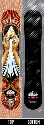
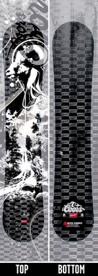
2006 COORS LTD. EDITION SNOWBOARDS
original sketches
(click on image to enlarge)
final board illustration #1
(click on image to enlarge)
final board illustration #2
(click on image to enlarge)
Well, my two snowboard designs are finally out and available for you to WIN at your local pub, tavern or bar near you. I concepted and illustrated both of these designs for the 2006 Coors snow program.These were a lot of fun and a challenge for me to do. I have worked on many of the past Coors snowboard designs, but this was the first time I was able to go from my concept to final illustration. My Art Director on the project was out of the office for a week because his wife was having a baby. I was asked to step in and take on the dual roles of Art Director and Illustrator.
We had originally went after "Studio No.1" (Shepard Fairey) to do all of the illustration for the 2006 Coors snow campaign and my only responsibility would have been setting up all of the art and making sure that it would fit all of the different dimensions for the POS, Merch, and Perm elements that we had sold to the client. Due to some very long legal issues and really bad timing, plus diabetes and an eye with a busted blood vessel (long story....), I ended up with the responsibility of illustrating the snow program with a now terribly tight deadline.........
(click on image to enlarge)
Above is the original version of the "Ram" snowboard before all of the client changes. For some reason I really like the look of this board compared to the final version. I like the organic look, the choice of colors, and the technique in which I rendered the art. I still think the "Ram" board is nice, I am just partial to the original concept.
So, after many long hours of design, illustration, and client revisions, we ended up with some really cool art and a very successful program. Let's hope that the snow program next year goes a little smoother, but is equally as successful.
Please remember to always buy Coors products.
Jack
Subscribe to:
Posts (Atom)